
Who has the best logo?
71 posts
• Page 2 of 4 • 1, 2, 3, 4


Who has the best logo?
![]() by the joker » Wed Oct 19, 2011 3:44 pm
by the joker » Wed Oct 19, 2011 3:44 pm
Bombers
I love vegatarian food. It goes great with steak.


Re: Who has the best logo?
![]() by Barto » Wed Oct 19, 2011 4:21 pm
by Barto » Wed Oct 19, 2011 4:21 pm
Although it's a little busy, the Melbourne one is a cracker compared to the rest.
Collingwood would be second for me.
Collingwood would be second for me.
It's all the SANFL's fault.


Re: Who has the best logo?
![]() by Mr Beefy » Wed Oct 19, 2011 4:29 pm
by Mr Beefy » Wed Oct 19, 2011 4:29 pm
Collingwood would be first if they didn't hijack that Aussie flag, so its Melbourne for me.

Re: Who has the best logo?
![]() by best on hill » Wed Oct 19, 2011 4:44 pm
by best on hill » Wed Oct 19, 2011 4:44 pm
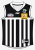
i really like the look of the collingood one.
COWELL FOOTBALL CLUB est.1901
premiers 1902,04,07,22,24,26,27,28,31,32,34,37,38,39,46,50,52,53,54,55,58,59,69(cowell north),96,99,2006,07,09
oldest club on E.P.!
premiers 1902,04,07,22,24,26,27,28,31,32,34,37,38,39,46,50,52,53,54,55,58,59,69(cowell north),96,99,2006,07,09
oldest club on E.P.!
-

best on hill - League Bench Warmer
-


- Posts: 1007
- Joined: Fri Feb 29, 2008 9:52 am
- Location: standing on magarey mound
- Has liked: 0 time
- Been liked: 1 time
- Grassroots Team: Cowell
-

Drop Bear - League - Top 5
-


- Posts: 2833
- Joined: Thu Jul 26, 2007 2:12 pm
- Location: The Doghouse
- Has liked: 0 time
- Been liked: 0 time
- Grassroots Team: Hope Valley
Re: Who has the best logo?
![]() by Dog_ger » Wed Oct 19, 2011 5:38 pm
by Dog_ger » Wed Oct 19, 2011 5:38 pm
Pag wrote:Collingwood.
Agreed.
Collingwood x 2
I thought there was a law stating : you cannot use the the Australian Flag on a company thingy...?
But it is Collingwood.
Melbourne may be in breach of the law with the "Southern Cross"...?

Smile :)
It's only Money $$$ :)
What is happening to our SANFL guys...
It's only Money $$$ :)
What is happening to our SANFL guys...


-

The Dark Knight - Coach
- Posts: 35506
- Joined: Sat Mar 06, 2010 12:32 pm
- Location: Gotham City
- Has liked: 11596 times
- Been liked: 1652 times
- Grassroots Team: North Haven
Re: Who has the best logo?
![]() by Wedgie » Wed Oct 19, 2011 7:38 pm
by Wedgie » Wed Oct 19, 2011 7:38 pm
Asked my 12 yo son and he liked the Kangaroos the best.
Armchair expert wrote:Such a great club are Geelong

Re: Who has the best logo?
![]() by cripple » Wed Oct 19, 2011 7:42 pm
by cripple » Wed Oct 19, 2011 7:42 pm
Personally think Melbourne's and Freo's are the best.
- cripple
- League Bench Warmer
-


- Posts: 1261
- Joined: Thu Jun 28, 2007 12:21 am
- Location: Mexico
- Has liked: 0 time
- Been liked: 0 time
Re: Who has the best logo?
![]() by Media Park » Wed Oct 19, 2011 8:19 pm
by Media Park » Wed Oct 19, 2011 8:19 pm
Melbourne.
Direct quote:
Wedgie wrote:I wear skin tight arseless leather pants, wtf do you wear?
-
Media Park - Coach
-


- Posts: 13864
- Joined: Tue Jul 10, 2007 4:28 pm
- Has liked: 0 time
- Been liked: 0 time
- Grassroots Team: Boston
Re: Who has the best logo?
![]() by Mr66 » Wed Oct 19, 2011 8:50 pm
by Mr66 » Wed Oct 19, 2011 8:50 pm
Melbourne & St Kilda (Best logo, worst club)
Collingwood a close third.
Collingwood a close third.

Re: Who has the best logo?
![]() by Ian » Wed Oct 19, 2011 10:14 pm
by Ian » Wed Oct 19, 2011 10:14 pm
I picked Collingwood's (who I despise) and Melbourne's, if I could have picked a third it would have been St Kilda's. I love the coat of arm / crest logo's, when North Adelaide changed theirs a couple of years ago I wish they had gone to a modernised version of the old coat of arms.
North Adelaide F C : Champions of Aust 1972 : Premiers 1900, 02, 05, 20, 30, 31, 49, 52, 60, 71, 72, 87, 91


Re: Who has the best logo?
![]() by Hondo » Wed Oct 19, 2011 10:28 pm
by Hondo » Wed Oct 19, 2011 10:28 pm
None really stir me too much one way or the other. I think the guernsey designs represent the club moreso than these logos.
I picked the Eagles and the Swans though. Simple but effective. I like Collingwood's. Melbourne's is striking however it doesn't really say "Demons" to me. Moreso it says "the Australian Flag". Why is the Southern Cross on it? With the cartoon devil's fork thrown in with all the old-style design it's a bit too busy I think.
Geelong's is good too.
In between signatures .....

Re: Who has the best logo?
![]() by westozfalcon » Wed Oct 19, 2011 11:22 pm
by westozfalcon » Wed Oct 19, 2011 11:22 pm
Hondo wrote:None really stir me too much one way or the other. I think the guernsey designs represent the club moreso than these logos.
I picked the Eagles and the Swans though. Simple but effective. I like Collingwood's. Melbourne's is striking however it doesn't really say "Demons" to me. Moreso it says "the Australian Flag". Why is the Southern Cross on it? With the cartoon devil's fork thrown in with all the old-style design it's a bit too busy I think.Geelong's is good too.
Totally agree with that; way too 'busy' a design.
I like Sydney's the best. It encapsulates the city and the club's heritage with a minimum of fuss.
- westozfalcon
- League Bench Warmer
-
- Posts: 1082
- Joined: Mon Oct 30, 2006 10:30 pm
- Location: Perth WA
- Has liked: 113 times
- Been liked: 28 times
Re: Who has the best logo?
![]() by Jimmy » Wed Oct 19, 2011 11:31 pm
by Jimmy » Wed Oct 19, 2011 11:31 pm
Saints 
Can someone do the same with the 80's logos? They were awesome!
Can someone do the same with the 80's logos? They were awesome!
Carn the blues!!!!!

Re: Who has the best logo?
![]() by Magpiespower » Thu Oct 20, 2011 8:10 am
by Magpiespower » Thu Oct 20, 2011 8:10 am
Sydney - simple, strong and stylish.
Then the Bulldogs.
Hope Sonic is popular with the kids - the Crows' previous logo did the job pretty well.
Melbourne's is a shocker.
Confused, cluttered mess reeks of design-by-committee.
We need this for this demographic, that for that demographic.
Overall, they're pretty uninspired...
Then the Bulldogs.
Hope Sonic is popular with the kids - the Crows' previous logo did the job pretty well.
Melbourne's is a shocker.
Confused, cluttered mess reeks of design-by-committee.
We need this for this demographic, that for that demographic.
Overall, they're pretty uninspired...
Everyone can eat s#!t! A big bag of s#!t! I'm the greatest man in the world!
-
Magpiespower - Coach
-
- Posts: 6292
- Joined: Thu Oct 27, 2005 9:12 am
- Location: Salisbury
- Has liked: 0 time
- Been liked: 125 times
- Grassroots Team: Salisbury
Re: Who has the best logo?
![]() by Mr Beefy » Thu Oct 20, 2011 8:15 am
by Mr Beefy » Thu Oct 20, 2011 8:15 am
Jimmy wrote:Saints
Can someone do the same with the 80's logos? They were awesome!
Here's a start!!
Re: Who has the best logo?
![]() by Magpiespower » Thu Oct 20, 2011 8:20 am
by Magpiespower » Thu Oct 20, 2011 8:20 am
Jimmy wrote:Saints
North Melbourne was my favourite...

And my least favourite...

Everyone can eat s#!t! A big bag of s#!t! I'm the greatest man in the world!
-
Magpiespower - Coach
-
- Posts: 6292
- Joined: Thu Oct 27, 2005 9:12 am
- Location: Salisbury
- Has liked: 0 time
- Been liked: 125 times
- Grassroots Team: Salisbury
71 posts
• Page 2 of 4 • 1, 2, 3, 4
Who is online
Users browsing this forum: No registered users and 15 guests
Advertisements by Advertisement Management