
West End Flag comp
West End Flag comp
![]() by - » Fri Jun 30, 2006 10:16 am
by - » Fri Jun 30, 2006 10:16 am
Nor ban a user for an acceptable topic of discussion.
"Baby on board". Why dont you put a sign on ur car saying "adult on board" or "car stereo in use"?
- -
- Reserves
- Posts: 863
- Joined: Tue Nov 01, 2005 8:12 pm
- Has liked: 0 time
- Been liked: 0 time
![]() by MightyEagles » Fri Jun 30, 2006 10:22 am
by MightyEagles » Fri Jun 30, 2006 10:22 am
Eagles - P 528 W 320 L 205 D 3 W% 60.89
WFC - P 575 W 160 L 411 D 4 W% 28.17
WTFC - P 1568 W 702 L 841 D 25 W% 45.56
Total - P 2671 W 1183 L 1457 D 32 W% 44.88
3 Flags - 1 Club
- MightyEagles
- Coach
-


- Posts: 11771
- Joined: Tue Nov 08, 2005 3:38 pm
- Location: The MightyEagles Memorial Timekeepers Box
- Has liked: 10 times
- Been liked: 12 times
- Grassroots Team: United Eagles
![]() by Rushby Hinds » Fri Jun 30, 2006 11:19 am
by Rushby Hinds » Fri Jun 30, 2006 11:19 am
-

Rushby Hinds - League - Best 21
-

- Posts: 1520
- Joined: Mon Nov 07, 2005 9:40 pm
- Has liked: 0 time
- Been liked: 0 time
![]() by redandblack » Fri Jun 30, 2006 11:59 am
by redandblack » Fri Jun 30, 2006 11:59 am
Top bloke.
We won something at last
- redandblack
![]() by RoosterMarty » Fri Jun 30, 2006 5:25 pm
by RoosterMarty » Fri Jun 30, 2006 5:25 pm
-

RoosterMarty - Coach
-

- Posts: 6524
- Joined: Sat Nov 12, 2005 9:30 pm
- Location: Adelaide (near Prospect Oval)
- Has liked: 10 times
- Been liked: 0 time
![]() by Punk Rooster » Fri Jun 30, 2006 5:52 pm
by Punk Rooster » Fri Jun 30, 2006 5:52 pm
Borat wrote:The designer of the Bays flag is one of the more attractive Snouts, and does indeed post on here. "Thumby" the Tiger is also on the flag apparently.
An attractive Snout? Does such a mythical creature exist? Maybe we should have 'em stuffed...
(re: Well Sybil, a satisfied customer... maybe we should have 'em stuffed)
Ralph Wiggum wrote:That's where I saw the leprechaun. He told me to burn things
Ken Farmer>John Coleman
Hindmarsh Pest Control
-

Punk Rooster - Coach
-

- Posts: 11948
- Joined: Thu Oct 27, 2005 9:30 am
- Location: Paper Street Soap Company
- Has liked: 16 times
- Been liked: 16 times
- Grassroots Team: Fitzroy
![]() by bay_girl23 » Fri Jun 30, 2006 5:57 pm
by bay_girl23 » Fri Jun 30, 2006 5:57 pm
-

bay_girl23 - Member
-
- Posts: 98
- Joined: Sat Oct 29, 2005 4:13 pm
- Location: Glenelg Oval
- Has liked: 0 time
- Been liked: 5 times
![]() by Wedgie » Fri Jun 30, 2006 5:59 pm
by Wedgie » Fri Jun 30, 2006 5:59 pm
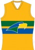
West: emblem doesn't look a thing like a blood hound, stupid.
Bulldogs: just their emblem stuck on a blue background, boring.
Glenelg: lots of triangles for no reason with normal emblem, yuk.
North: not even the same Vee they wear on their guernsey, stupid and boring.
Norwood: not even their up to date emblem, stupid.
Port: emblem on guernsey, boring.
South: When the hell did they get a 3rd colour? Besides that oversight just the old emblem with SA on god knows what background, stupid and boring.
Sturt: boring emblem on boring background with AFL posts added, WTF and boring.
Eagles: WWTFC more prominent than an eagle on a badge, boring but ironically one which is a bit 'different' and came last!!
At least the Westies design was original which is why Im assuming it won, well done to the lad that one it, showed a bit of imagination at least.


![]() by Wedgie » Fri Jun 30, 2006 6:04 pm
by Wedgie » Fri Jun 30, 2006 6:04 pm
bay_girl23 wrote:hee hee... i created the glenelg flag! unfortuantly, they took of the snouts louts logo and put a west end draught logo in its place! boo them!
That explains why most of them are boring, it sounds like they might have been butchered by West End/SANFL to suit their own purposes, certainly puts a bit of perspective on them, my criticism then is to West End/SANFL.
![]() by bay_girl23 » Fri Jun 30, 2006 6:10 pm
by bay_girl23 » Fri Jun 30, 2006 6:10 pm
-
bay_girl23 - Member
-
- Posts: 98
- Joined: Sat Oct 29, 2005 4:13 pm
- Location: Glenelg Oval
- Has liked: 0 time
- Been liked: 5 times
![]() by Wedgie » Fri Jun 30, 2006 6:38 pm
by Wedgie » Fri Jun 30, 2006 6:38 pm
bay_girl23 wrote:mine was actually changed a bit... the eagles supporter also told me that his was changed quite a bit too. i was very disappointed that they took the snouts logo off... but what can you do?
Yeah exactly bay_girl, but at least you helped in a bit of promotion for the Bays and the SANFL, disappointing they were changed, I'd prefer to see the originals.
I'm assuming they may have not wanted anything too extreme or different which is a shame, I could base one or 2 on Tshirts I've made over the years and even better a Grog Squad flag with a drunken Rooster holding a can of West End would be great!
![]() by rod_rooster » Fri Jun 30, 2006 6:45 pm
by rod_rooster » Fri Jun 30, 2006 6:45 pm
Wedgie wrote:North: not even the same Vee they wear on their guernsey, stupid and boring.
Should be the Vee we wear though.
- rod_rooster
- Coach
- Posts: 6594
- Joined: Thu Oct 27, 2005 11:56 pm
- Has liked: 9 times
- Been liked: 24 times
![]() by Wedgie » Fri Jun 30, 2006 6:45 pm
by Wedgie » Fri Jun 30, 2006 6:45 pm
rod_rooster wrote:Wedgie wrote:North: not even the same Vee they wear on their guernsey, stupid and boring.
Should be the Vee we wear though.
Yeah, maybe, I wouldn't have an issue if we did but the flag should match the guernsey.
Personally I'd prefer one of the pre Patterson Vees but do like that one too.
![]() by spell_check » Fri Jun 30, 2006 7:06 pm
by spell_check » Fri Jun 30, 2006 7:06 pm
- spell_check
- Coach
-
- Posts: 18723
- Joined: Fri Oct 28, 2005 11:56 pm
- Has liked: 45 times
- Been liked: 178 times
![]() by eaglehaslanded » Fri Jun 30, 2006 7:50 pm
by eaglehaslanded » Fri Jun 30, 2006 7:50 pm
Wedgie wrote:I think they were all pretty ordinary, perhaps if they offered a decent prize they might have got some quality.
West: emblem doesn't look a thing like a blood hound, stupid.
Bulldogs: just their emblem stuck on a blue background, boring.
Glenelg: lots of triangles for no reason with normal emblem, yuk.
North: not even the same Vee they wear on their guernsey, stupid and boring.
Norwood: not even their up to date emblem, stupid.
Port: emblem on guernsey, boring.
South: When the hell did they get a 3rd colour? Besides that oversight just the old emblem with SA on god knows what background, stupid and boring.
Sturt: boring emblem on boring background with AFL posts added, WTF and boring.
Eagles: WWTFC more prominent than an eagle on a badge, boring but ironically one which is a bit 'different' and came last!!
At least the Westies design was original which is why Im assuming it won, well done to the lad that one it, showed a bit of imagination at least.
I think you'll actually find wedgie they placed the winner up top and all others underneath in alphabetical order. Have another look at today's paper and correct me if I'm wrong. Otherwise Eagles wouldn't be last although not one of the best I thought it was at least a little creative. This is not me with just another ridiculously biased comment it's what I truly believe.
-
eaglehaslanded - League - Best 21
-
- Posts: 2355
- Joined: Fri Dec 23, 2005 6:06 pm
- Location: Melbourne "the sporting capital of Australia"
- Has liked: 0 time
- Been liked: 15 times
- Grassroots Team: Central United
![]() by redandblack » Fri Jun 30, 2006 8:06 pm
by redandblack » Fri Jun 30, 2006 8:06 pm
Can you tell me why Westies flag should have a bloodhound on it?
The flags are in alphabetical order, except for the winner.
Congratulations to all the club winners for a great effort.
- redandblack
![]() by Wedgie » Fri Jun 30, 2006 8:27 pm
by Wedgie » Fri Jun 30, 2006 8:27 pm
r&b, I would have thought Westies emblem was a blood(hound)?
Although different, I'm not sure what that animal on the winning flag was.
PS Guys, thanks for clearing up re the alphabetical order.
IMHO(in no particular order) the better ones were Port, West, Glenelg, North and Eagles but as I said I think West End's efforts were all pretty ordinary.
Just as an eg I like something different like the 2 Tshirts I've put out for rocketrooster.com over the years:


Or perhaps something different again with:

The Grog Squad T-shirts are better again and better still, most of them promote the Japanese beer made at Hindmarsh!
Mind you, if you have to buy a carton of Japanese beer to enter I'd be in trouble there and then.
![]() by Wedgie » Fri Jun 30, 2006 8:37 pm
by Wedgie » Fri Jun 30, 2006 8:37 pm

![]() by Wedgie » Fri Jun 30, 2006 8:45 pm
by Wedgie » Fri Jun 30, 2006 8:45 pm
Peter Dutton Seacombe Gardens Sturt
Wolly Paunovic Woodville Port Adeladide Magpies
Janine Atkins Klemzig Glenelg
Brenton Heading Parafield Gardens Norwood
David Antal Camden Park North Adelaide
Lee Barrow Little Hampton West Adelaide
Andy Comrie Greenwith Central District
David Evans Tungkillo South Adelaide
Alan Stacey Glenelg East Eagles
![]() by bay_girl23 » Fri Jun 30, 2006 8:51 pm
by bay_girl23 » Fri Jun 30, 2006 8:51 pm
-
bay_girl23 - Member
-
- Posts: 98
- Joined: Sat Oct 29, 2005 4:13 pm
- Location: Glenelg Oval
- Has liked: 0 time
- Been liked: 5 times